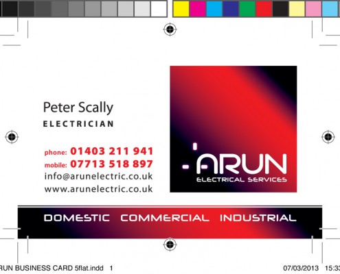
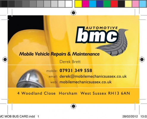
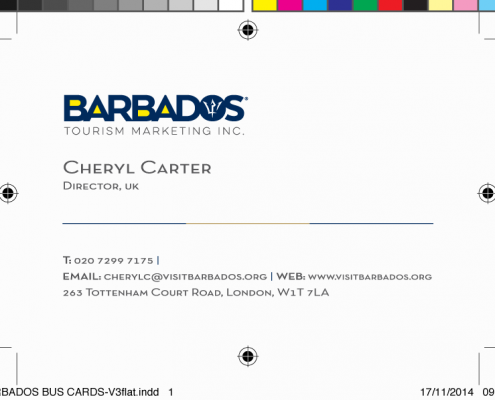
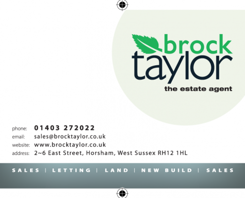
A business card is often the first physical representation of your brand you give to someone. As such it’s imperative to give the right impression. A poorly designed and printed card may indicate a less than professional approach putting you and your business at risk.
Top tips for business card brilliance:
Get them professionally designed – unless you have the skill get a graphic designer in. It’s not as expensive as you think.
- Keep it consistent – if you’ve already got an established logo and brand ensure it matches your card
- Don’t cram – keep your design simple, clear and free from distractions
- Use a readable typeface – obvious, but often overlooked when the font gets small
- Use the back – don’t forget you have two sides
- Don’t even think about…FREE cards off the internet. They’re cheap, poorly printed and carry the printers name on the back!


